library(sf)
library(tidyverse, quietly = TRUE)
library(spdep)
library(spatstat)
library(sp)
library(terra)
library(tmap)

cty <- tigris::counties(state = c("ID", "WA", "OR"), progress_bar=FALSE)


disast.sf <- read_csv("data/opt/data/2023/assignment07/ics209-plus-wf_incidents_1999to2020.csv") %>%
  filter(., START_YEAR >= 2000 & START_YEAR <= 2017) %>%
  select(INCIDENT_ID, , POO_STATE, POO_LATITUDE, POO_LONGITUDE, FATALITIES, PROJECTED_FINAL_IM_COST, STR_DESTROYED_TOTAL, PEAK_EVACUATIONS) %>%
  drop_na(c(POO_LATITUDE, POO_LONGITUDE)) %>%
  st_as_sf(coords = c("POO_LONGITUDE", "POO_LATITUDE"), crs= 4326) %>%
  st_transform(., st_crs(cty)) %>%
  distinct(., geometry, .keep_all=TRUE)

disast.sf <- disast.sf[cty,]Assignment 8 Solutions: Autocorrelation and Interpolation
Read in the disasters dataset, convert it to points, filter it to those disasters in Idaho, and select any relevant columns. You will also need to use tigris::county() to download a county shapefile for the region. Make sure your data are projected correctly
I start by loading the packages necessary for the entire analysis. Then, I use the
tigrispackage to get my county files. We need this for two reasons: to subset the disaster data into our region of interest. Note that I used the entire region because it’s possible that there is information to be learned from the data on the borders of Idaho that don’t conform to the state boundaries. I then load the disaster dataset, select a handful of columns that I’m interest in, drop any records that are missing their coordinates, convert thecsvto asfobject, project it to the same CRS as the county dataset, and then keep only thedistinctpoint locations. This last step is important because having multiple events in the exact same location creates issues for calculating our spatial autocorrelation estimates (because the distance is exactly zero making it difficult to determine which event is the “parent”).
Generate the Ripley’s K curves for the disaster dataset. What do you think? Is there evidence that the data is spatially autocorrelated? >We use the same code from class here to estimate the Ripley’s K function. We first select the variable we’re interested in (STR_DESTROYED_TOTAL in my case), transform the CRS to a planar coordinate system, and convert it to a ppp object for spdep. We use the envelope function with Kest to calculate several theoretical values for Ripley’s K under complete spatial randomness. Comparing the K_{obs} to the envelope of theoretical values suggests that there is more aggregation in the data than would be predicted under CSR.
kf.env <- envelope(as.ppp(st_transform(select(disast.sf, STR_DESTROYED_TOTAL), crs=8826)), Kest, correction = "translation",  nsim= 1000, envelope = TRUE, verbose = FALSE)

plot(kf.env)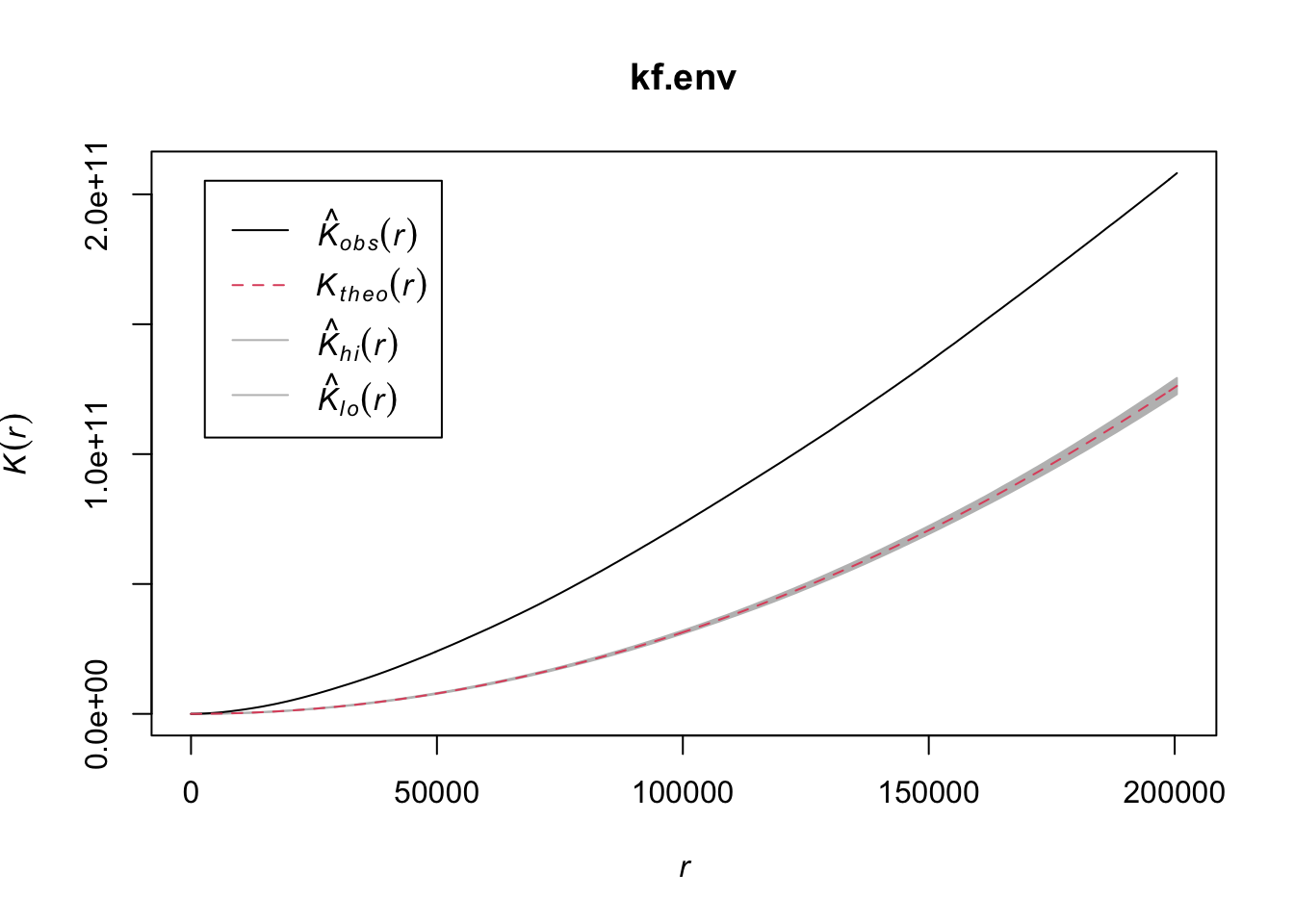
Use the nearest-neighbor approach that we used in class to estimate the lagged values for the disaster dataset and estimate the slope of the line describing Moran’s I statistic.
We begin by finding the nearest neighbor for each observation using the
knearneighfunction which finds thekclosest neighbors for each point. Because we only want the nearest neighbor, we setk=1. We need to convert this to a neighbor list (class(geog.nearnb) = nb) and do this by wrapping the output ofknearneighinside ofknn2nbwhich convertsknnobjects tonbobjects. We then need to estimate the distance to each neighbor (usingdnearneigh) and convert it to a spatial weights matrix (usingnb2listw). Finally, we convert this weight’s matrix into a vector of the same number of rows as our disaster dataset usinglag.listw. This function creates a new estimate ofSTR_DESTROYED_TOTALfor each row based on the spatially weighted value of the nearest neighbor. Finally, we fit a simple linear regression to the data and see that there is a slight positive slope to the line suggesting that there is some autocorrelation (remember, the slope of this simple linear model is the Moran’s I coefficient).
geog.nearnb <- knn2nb(knearneigh(disast.sf, k = 1), row.names = disast.sf$INCIDENT_ID, sym=TRUE); #estimate distance to first neareset neighbor
nb.nearest <- dnearneigh(disast.sf, 0,  max( unlist(nbdists(geog.nearnb, disast.sf))));
lw.nearest <- nb2listw(nb.nearest, style="W")
bldg.lag <- lag.listw(lw.nearest, disast.sf$STR_DESTROYED_TOTAL)
M <- lm(bldg.lag ~ disast.sf$STR_DESTROYED_TOTAL)
summary(M)
Call:
lm(formula = bldg.lag ~ disast.sf$STR_DESTROYED_TOTAL)

Residuals:
    Min      1Q  Median      3Q     Max
-4.1969 -0.9554 -0.7483 -0.0924 14.3268

Coefficients:
                              Estimate Std. Error t value Pr(>|t|)
(Intercept)                    1.04165    0.03505  29.721  < 2e-16 ***
disast.sf$STR_DESTROYED_TOTAL  0.01487    0.00309   4.812 1.56e-06 ***
---
Signif. codes:  0 '***' 0.001 '**' 0.01 '*' 0.05 '.' 0.1 ' ' 1

Residual standard error: 2.047 on 3438 degrees of freedom
Multiple R-squared:  0.00669,   Adjusted R-squared:  0.006402
F-statistic: 23.16 on 1 and 3438 DF, p-value: 1.557e-06plot(bldg.lag ~ disast.sf$STR_DESTROYED_TOTAL, xlim=c(0,20))
abline(M, col="red")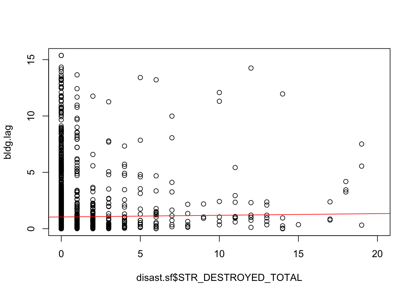
Now use the permutation approach to compare your measured value to one generated from multiple simulations. Generate the plot of the data. Do you see more evidence of spatial autocorrelation?
We can verify this by using a Monte Carlo permutation approach. We use a
forloop to “shuffle” the data (usingsample), but keep the same neighbor structure (using our samelw.nearestspatial weights matrix). We then fit a linear model to the reshuffled data and estimate the slope to see what values are plausible under complete spatial randomness (which we achieve by shuffling the data independent of their location). Run this loop 1000 times (set byn <- 1000L) and you’ll generate a distribution of plausible values. Based on the distribution and our actual value (in red), we can see that this value for Moran’s I is generally larger than we’d expect under CSR, but not terribly so.
n <- 1000L   # Define the number of simulations
I.r <- vector(length=n)  # Create an empty vector

for (i in 1:n){
  # Randomly shuffle income values
  x <- sample(disast.sf$STR_DESTROYED_TOTAL, replace=FALSE)
  # Compute new set of lagged values
  x.lag <- lag.listw(lw.nearest, x)
  # Compute the regression slope and store its value
  M.r    <- lm(x.lag ~ x)
  I.r[i] <- coef(M.r)[2]
}

hist(I.r, main=NULL, xlab="Moran's I", las=1)
abline(v=coef(M)[2], col="red")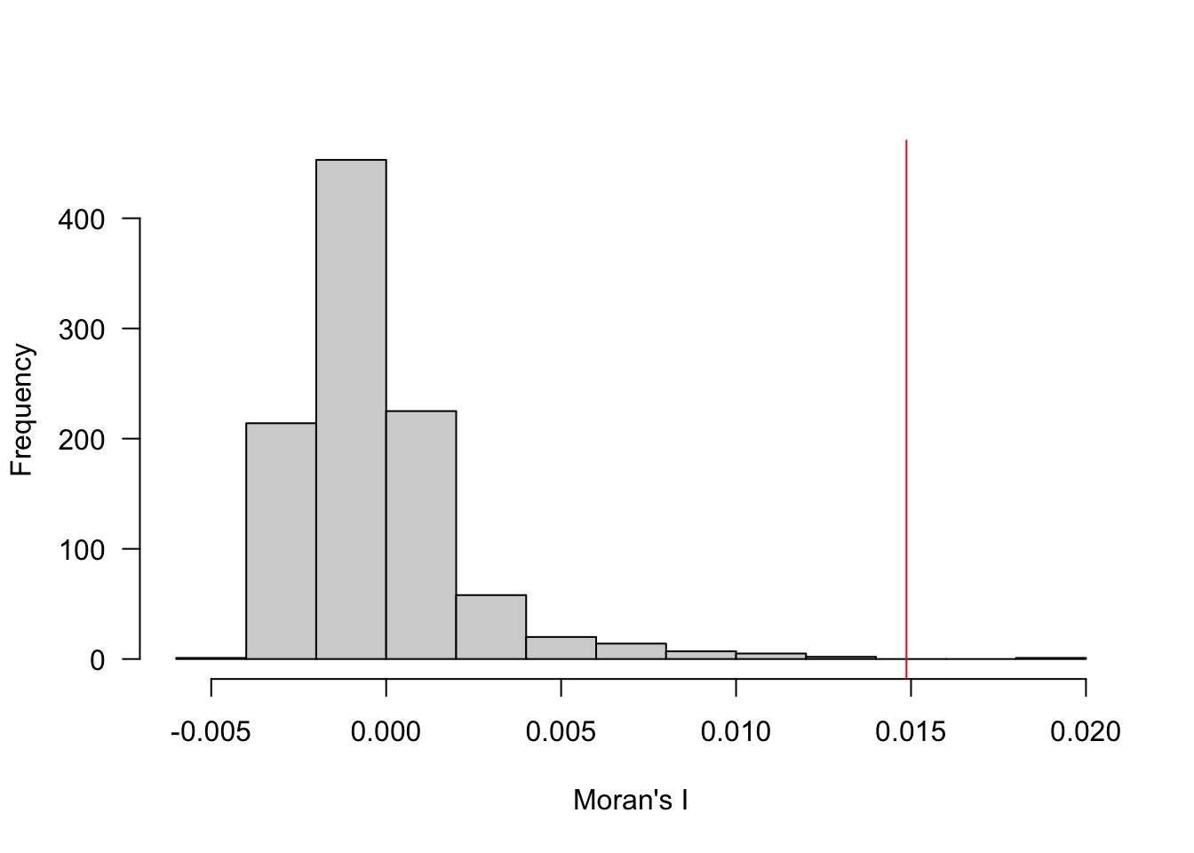
Generate the 0th, 1st, and 2nd order spatial trend surfaces for the data. Is there evidence for a second order trend? How can you tell?
In order to generate a spatial trend surface, we need to predict values across a uniform grid that covers the study region. We initialize that grid by using our county dataset and drawing 15000 random sample points across the region. We then create a series of formula object depicting the 0th, 1st (linear), and 2nd (quadratic) models to the data where the predictors are just the X and Y coordinates. We fit each of the models using
lm, convert them into aSpatialGridDataFramefrom thesppackage, and then convert them to a raster to make plotting easier. Based on the curvature we see in the 2nd order trend surface, there is an indication of a 2nd order trend, though it is not super strong. We’ll use that model for kriging in the subsequent steps.
grd <- as.data.frame(spsample(as(cty, "Spatial"), "regular", n=15000))
names(grd)       <- c("X", "Y")
coordinates(grd) <- c("X", "Y")
gridded(grd)     <- TRUE  # Create SpatialPixel object
fullgrid(grd)    <- TRUE  # Create SpatialGrid object
proj4string(grd) <- proj4string(as(disast.sf, "Spatial"))

f.0  <- as.formula(PROJECTED_FINAL_IM_COST ~ 1)

# Run the regression model
lm.0 <- lm( f.0 , data=disast.sf)

# Use the regression model output to interpolate the surface
dat.0th <- SpatialGridDataFrame(grd, data.frame(var1.pred = predict(lm.0, newdata=grd)))
r   <- rast(dat.0th)
r.m0 <- mask(r, st_as_sf(cty))

f.1  <- as.formula(STR_DESTROYED_TOTAL ~ X + Y)

disast.sf$X <- st_coordinates(disast.sf)[,1]
disast.sf$Y <- st_coordinates(disast.sf)[,2]

# Run the regression model
lm.1 <- lm( f.1 , data=disast.sf)

# Use the regression model output to interpolate the surface
dat.1st <- SpatialGridDataFrame(grd, data.frame(var1.pred = predict(lm.1, newdata=grd)))

# Convert to raster object to take advantage of rasterVis' imaging
# environment
r   <- rast(dat.1st)
r.m1 <- mask(r, st_as_sf(cty))

f.2 <- as.formula(STR_DESTROYED_TOTAL ~ X + Y + I(X*X)+I(Y*Y) + I(X*Y))

# Run the regression model
lm.2 <- lm( f.2, data=disast.sf)

# Use the regression model output to interpolate the surface
dat.2nd <- SpatialGridDataFrame(grd, data.frame(var1.pred = predict(lm.2, newdata=grd)))

r   <- rast(dat.2nd)
r.m2 <- mask(r, st_as_sf(cty))
rst.stk <- c(r.m0, r.m1, r.m2)
names(rst.stk) <- c("zeroOrder", "firstOrder", "secondOrder")
plot(rst.stk)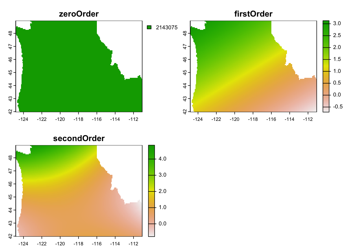
Now use the spatial trend surface to perform some ordinary krigging. You’ll want to have a grid of 15,000 points, fit 3 different experimental variogram functions (see the vgm function helpfile to learn more about the shapes available to you). Plot your variogram fits. Which one would you choose? Why?
A variogram simply plots the relationship between distance and the residuals of a model. We first assign those residuals to our disaster dataset. We then generate a cloud-style variogram for data without eliminating the spatial trend. As you can see, there are some strange bands that show up in the data likely due to the second order effects we saw in the model previously.
disast.sf$res <- lm.2$residuals

var.cld  <- gstat::variogram(res ~ 1, disast.sf, cloud = TRUE)
var.df  <- as.data.frame(var.cld)


OP <- par( mar=c(4,6,1,1))
plot(var.cld$dist/1000 , var.cld$gamma, col="grey",
     xlab = "Distance between point pairs (km)",
     ylab = expression( frac((res[2] - res[1])^2 , 2)) )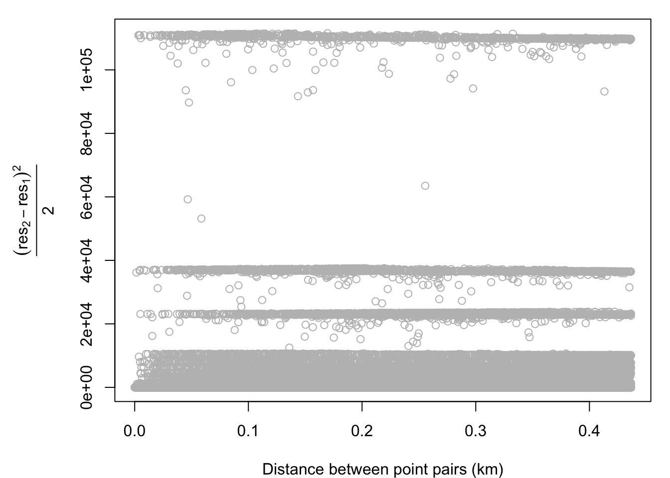
par(OP)We then fit a variogram to the detrended data (this is the sample variogram) by passing our
f.2formula to the variogram function. We take the mean values of the pairwise differences and plot them in bins on top of the original data. As you can see, this reduces a considerable amount of noise and the shape of the variogram begins to materialize.
var.smpl <- gstat::variogram(f.2, disast.sf, cloud = FALSE)

bins.ct <- c(0, var.smpl$dist , max(var.cld$dist) )
bins <- vector()
for (i in 1: (length(bins.ct) - 1) ){
  bins[i] <- mean(bins.ct[ seq(i,i+1, length.out=2)] )
}
bins[length(bins)] <- max(var.cld$dist)
var.bins <- findInterval(var.cld$dist, bins)
var.cld2 <- var.cld[var.cld$gamma < 500,]
OP <- par( mar = c(5,6,1,1))
plot(var.cld2$gamma ~ eval(var.cld2$dist/1000), col=rgb(0,0,0,0.2), pch=16, cex=0.7,
     xlab = "Distance between point pairs (km)",
     ylab = expression( gamma ) )
points( var.smpl$dist/1000, var.smpl$gamma, pch=21, col="black", bg="red", cex=1.3)
abline(v=bins/1000, col="red", lty=2)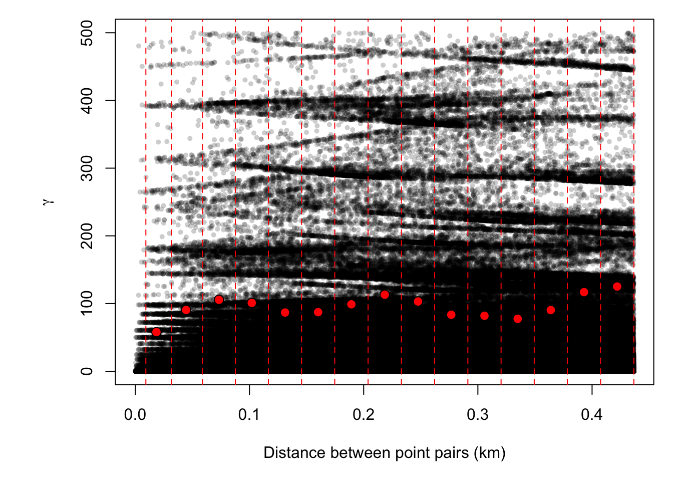
par(OP)You can use
vgm()to see potential shapes of the different variograms that we can fit usinggstat. I chose linear, Gaussian, and spherical as they are common choices and because the initial rise to the sill seemed consistent with those shapes. Note that the semivariance begins to increase again you get further out. This might suggest that we need a more complicated de-trending model, but we won’t worry about that now. The 3 forms seem to fit the data in similar ways, but the spherical form has a slightly more gradual rise to the sill. I choose that one as that may help smooth a bit more than the other 2.
# Compute the variogram model by passing the nugget, sill and range values
# to fit.variogram() via the vgm() function.
dat.fit.lin  <- gstat::fit.variogram(var.smpl, gstat::vgm(psill= 50, model="Lin"))
dat.fit.gau  <- gstat::fit.variogram(var.smpl, gstat::vgm(psill=50, model="Gau"))
dat.fit.sph  <- gstat::fit.variogram(var.smpl, gstat::vgm(psill=50, model="Sph"))

# The following plot allows us to gauge the fit
plot(var.smpl, dat.fit.lin, main = "Linear variogram")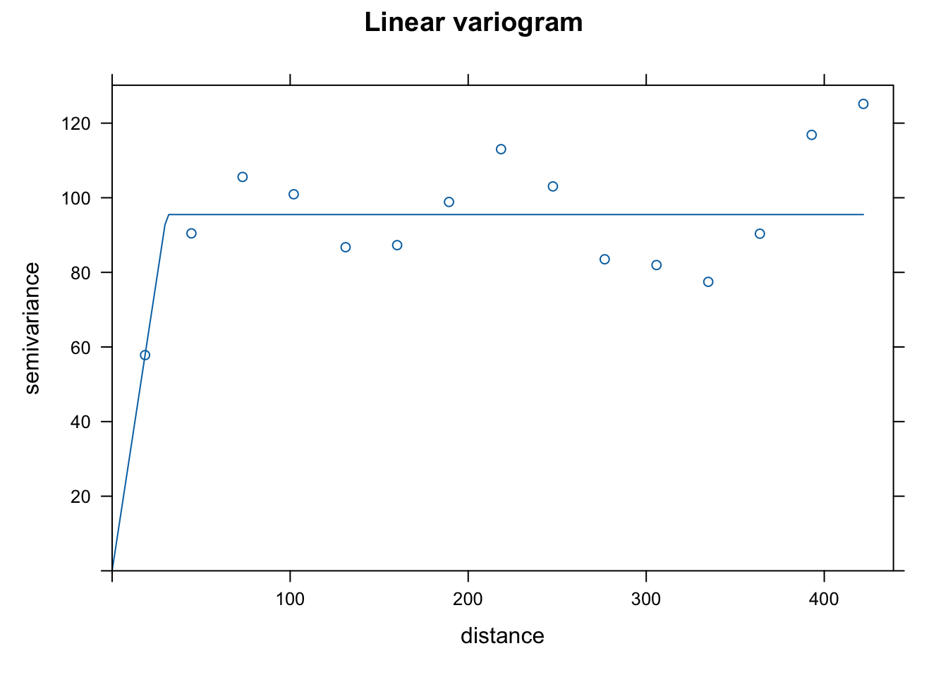
plot(var.smpl, dat.fit.gau, main = "Gaussian variogram")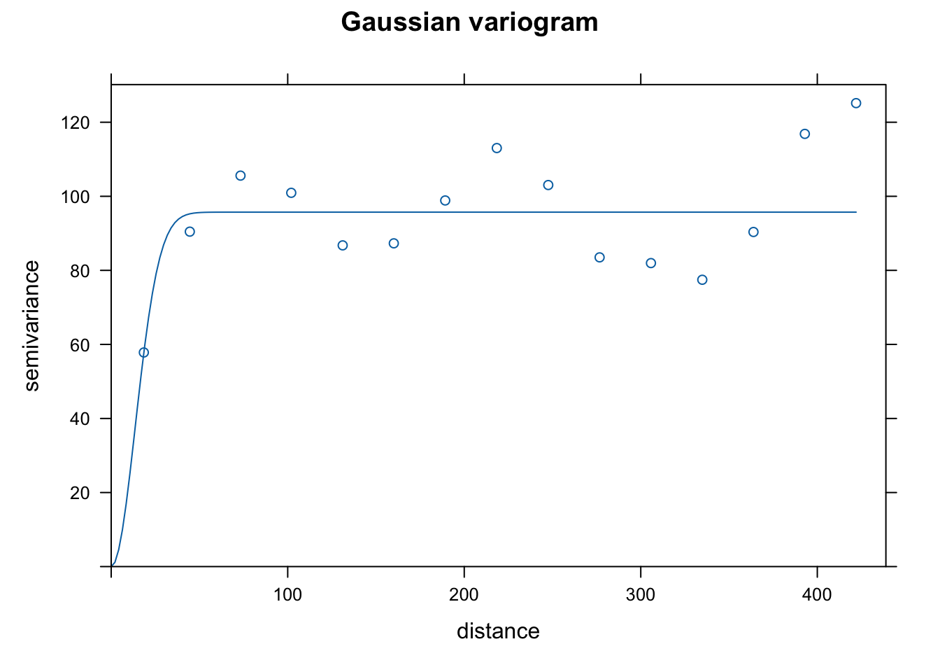
plot(var.smpl, dat.fit.sph, main = "Spherical variogram")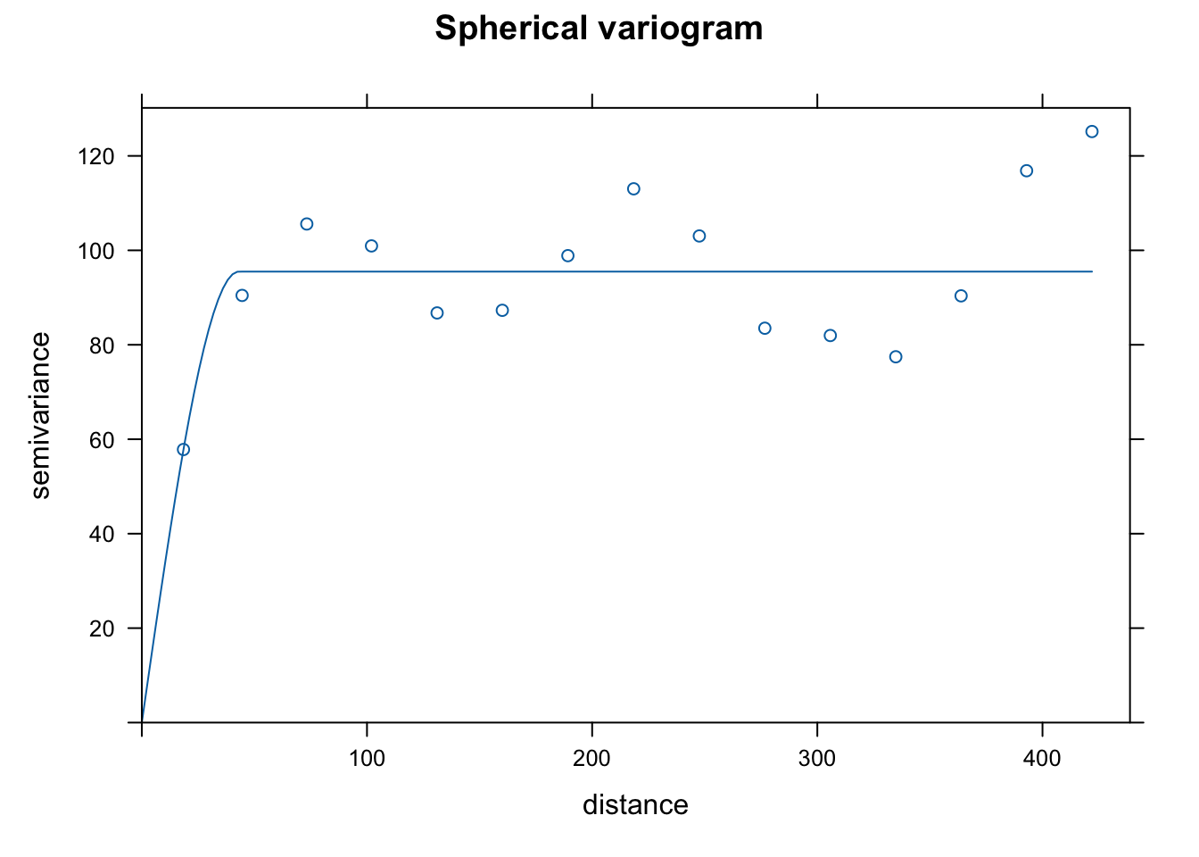
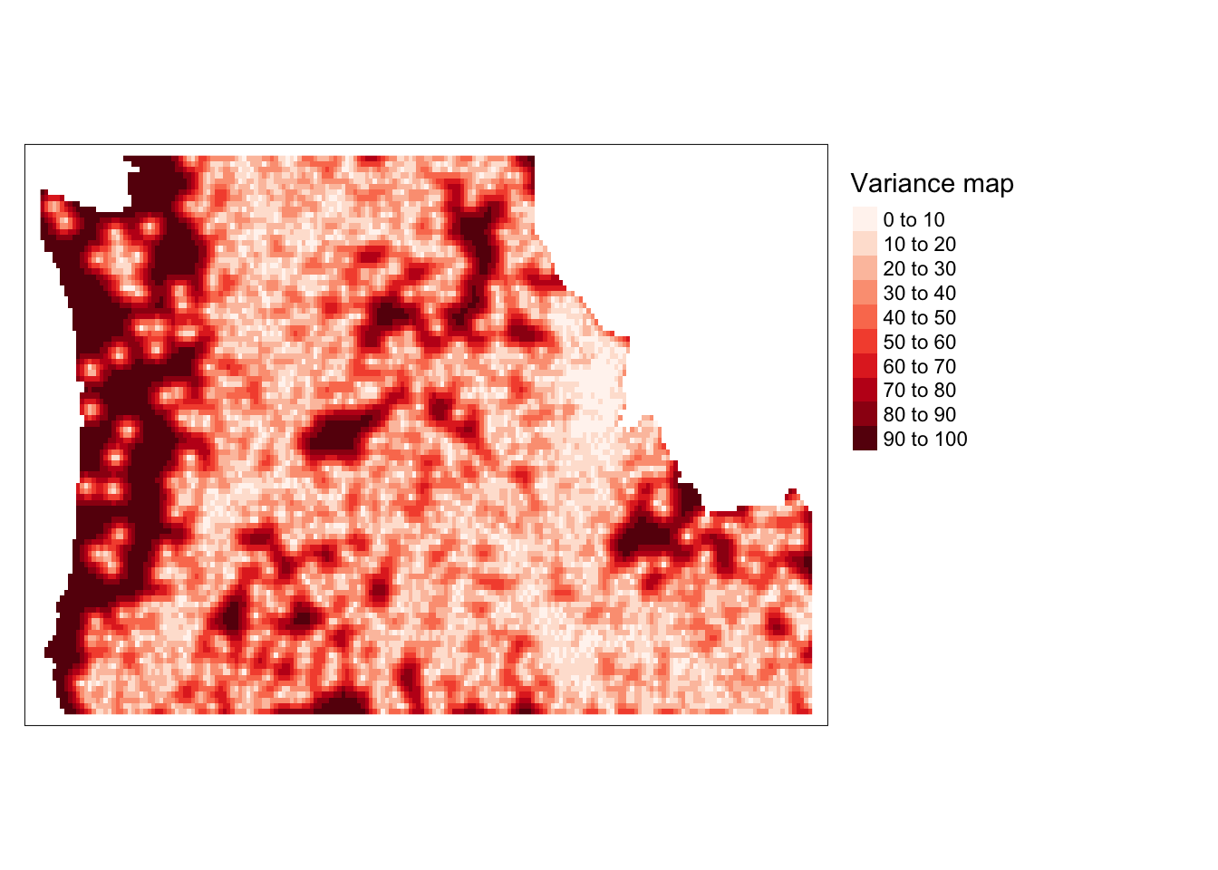
Using your spatial trend model and your fitted variogram, krige the data and generate a map of the interpolated value and a map of the error.
Now that we’ve got our Spherical variogram estimated on the detrended data, we can use the
krigefunction to generate spatial predictions across the grid. We can also access the variance resulting from that model. We do that, convert them to rasters and plot the two outcomes. We can see that we’ve eliminated the bulk of spatial patterns in the residuals (as evidenced by light colors on the predicted residual map); however, the predictions for the western cost are much less stable (as evidenced by the variance map).
dat.krg <- gstat::krige( res~1, as(disast.sf, "Spatial"), grd, dat.fit.sph)[using ordinary kriging]r <- rast(dat.krg)$var1.pred
r.m.pred <- mask(r, st_as_sf(cty))
tm_shape(r.m.pred) + tm_raster(n=10, palette="RdBu", title="Predicted residual \nstructures destroyed") +
tm_legend(legend.outside=TRUE)Variable(s) "NA" contains positive and negative values, so midpoint is set to 0. Set midpoint = NA to show the full spectrum of the color palette.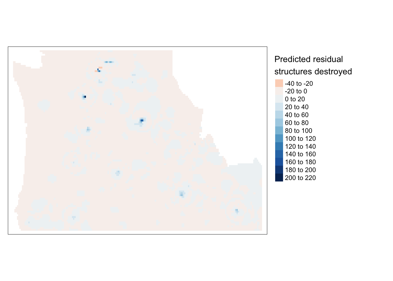
r <- rast(dat.krg)$var1.var
r.m.var <- mask(r, st_as_sf(cty))
tm_shape(r.m.var) + tm_raster(n=7, palette ="Reds", ,title="Variance map ") +
  tm_legend(legend.outside=TRUE)